Want to make your iOS app’s lists more organized, scannable, and user-friendly? Whether it’s contacts, products, or categories, choosing the right sectioning pattern can make a huge difference. Here are the top 3 ways to structure sections in iOS apps—each with its best use case, code and real examples.
1. Sticky Section Headers (Best for Categorized Content)
Best for: Contacts, Settings, Playlists, Grouped Data.
Examples: Apple Contacts, iOS Settings, Spotify Playlists.
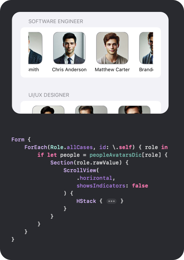
2. Horizontal Scroll Sections (Best for Featured or Trending Items)
Best for: Shopping, Streaming, News, Multi-category Lists.
Examples: Netflix (movies by genre), App Store (top apps by category).
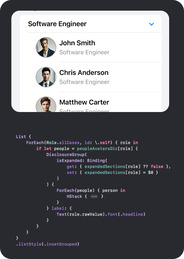
3. Expandable/Collapsible Sections (Best for Long Lists with Subcategories)
Best for: FAQs, Product Categories, Nested Lists.
Examples: Apple Notes (folder-based list), Settings app (Privacy & Security).
Choosing the right section pattern depends on your app’s content and user interaction needs:
• Use Sticky Headers for organized, searchable lists.
• Use Horizontal Scroll for featured or media-heavy content.
• Use Expandable Sections for nested or collapsible categories.
Which pattern do you prefer in your iOS apps? Let me know in the comments!
Want more iOS design insights, best practices, and UX tips? Subscribe to the newsletter so you never miss an update!


