


Mastering Action Buttons in SwiftUI
3 Approaches with Task Management App Case Study

This collection demonstrates three distinct approaches to implementing action buttons in SwiftUI, each optimized for different contexts and user needs.
We'll explore these patterns in the context of a task management app, showing how each approach affects the user experience and interaction flow.

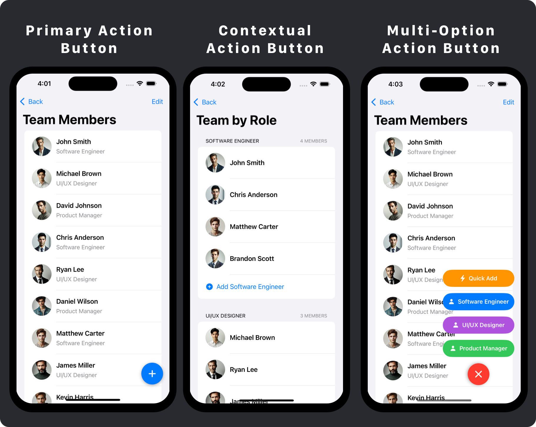
The Primary Action Button pattern, often implemented as a Floating Action Button (FAB), places a prominent button that floats above the content, typically in the bottom-right corner. This pattern is ideal when there's a clear primary action that users will perform frequently.
In SwiftUI, this is achieved using a ZStack with alignment to position the button over the content. The button uses a circular shape, bold color, and shadow to create visual hierarchy and draw attention. This pattern works best when the action is consistent across the app and is used frequently by users.

The Contextual Action Button pattern places buttons directly within the content they affect, such as at the end of category sections. This creates a clear relationship between the button and its context, making it easier for users to understand what will happen when they tap it.
In SwiftUI, this is implemented by placing buttons within List sections, with styling that matches the context (such as using category colors). This pattern is ideal when users need to add items to specific categories or contexts, as it reduces the cognitive load of having to select a category after tapping a generic 'add' button.

The Multi-Option Action Button pattern starts with a single floating button that expands to reveal multiple related actions when tapped. This combines the visual prominence of a floating action button with the contextual specificity of inline buttons.
In SwiftUI, this is implemented using animations and state management to control the appearance and disappearance of option buttons. This pattern is ideal for apps where users need to choose between multiple related actions, such as adding different types of content.
It keeps the interface clean while still providing quick access to various options.
Conclusion
When choosing an action button pattern for your app, consider the frequency and importance of the action, the need for contextual specificity, and the complexity of the action flow.
Primary Action Buttons work best for frequent, consistent actions that apply globally.
Contextual Action Buttons are ideal when the action is specific to a particular context or category.
Multi-Option Action Buttons strike a balance, offering the prominence of a floating button with the flexibility of multiple options.
For the best user experience, ensure your action buttons are easily discoverable, provide clear feedback, and maintain consistency with the overall design language of your app.
If you enjoyed this article, consider subscribing to my newsletter for more SwiftUI patterns and iOS development tips. Each week, I share practical UI patterns, code examples, and design insights to help you build better iOS apps.